✏️ Step-by-Step Magic
Establishing the Scholarly Foundation
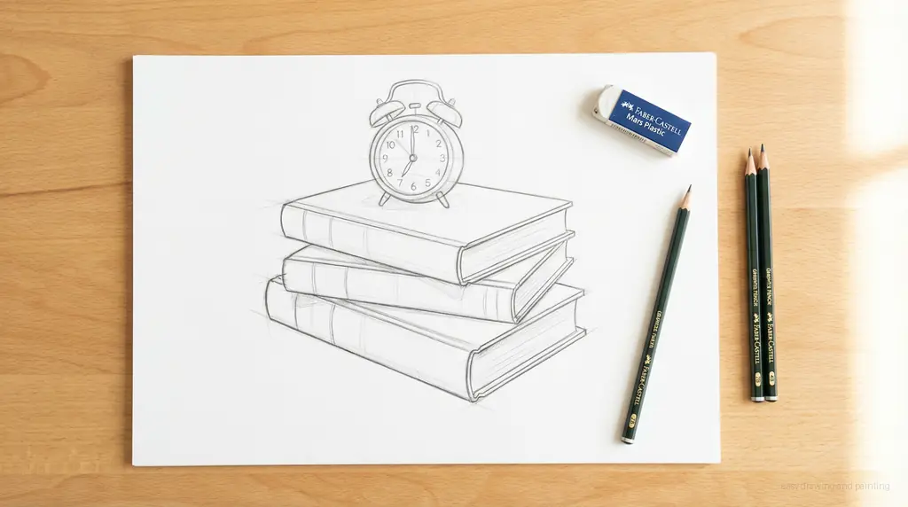
Every good drawing starts with simple scaffolding. Lightly sketch three slightly offset rectangles stacked one on top of the other—these will be our books. Make sure they are a bit rounded and chunky for that cute aesthetic feel. On top, sketch a small, simple shape for an alarm clock, perhaps a circle or a rounded square. Keep your lines very light!
Adding Time and Tension: The Clock and the Banner
Now, let’s add some life! Refine the book shapes by adding a subtle curved line down the front of each stack to define the spine. For the clock, add little triangular feet underneath and a clean circle for the face. Most importantly, sketch a large, flowing, waving banner shape arching gracefully over the top of the stack. This banner is where you'll write your important heading!
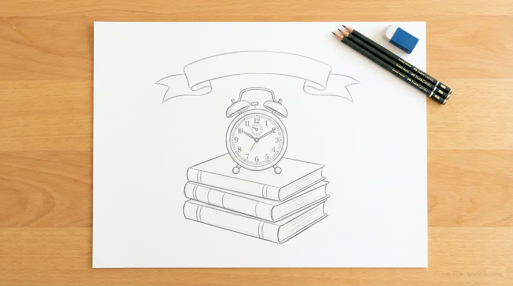
Refining the Details and Erasing Grime

Time to put the polish on our pencil work. Add simple lines to the clock face for the hands (maybe set to a classic 'school starts now' time!). Give the books simple rectangular labels or straps. Use your eraser to carefully clean up any construction lines inside the shapes, especially where the banner folds. For extra cuteness, sprinkle a few tiny stars or hearts around the stack—these little accents make the doodle pop!
Tracing the Bold Aesthetic Outline

This is where the magic happens! Take your fine-tip black marker and trace every final pencil line carefully and slowly. Use confident, smooth strokes to achieve that clean, bold aesthetic look. Once the ink is dry, gently erase every trace of graphite underneath. You should be left with a crisp, high-contrast black line drawing that is ready for printing or coloring.
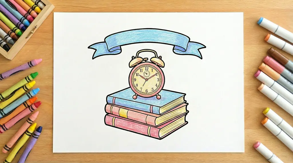
The Printable Coloring Page

Before we dive into color, take a moment to admire your clean line work! This crisp outline is perfect for printing, transferring, or scaling down to use as a tiny planner icon. Notice how the bold lines define the cute, cozy structure of the stack.
Filling with Cozy, Inspiring Colors

It's time to bring warmth to our workspace! For an aesthetic look, stick to a gentle, cohesive palette. I love soft pastels—think cozy blush pinks, light mint greens, and creamy yellows for the book covers. Use a cheerful yellow for the clock and a slightly darker shade for the banner to make your header pop. Apply your color smoothly, leaving the white of the paper to enhance the light, airy feel!
Community Drawings & Comments
Comments are coming soon! Stay tuned to share your masterpieces.